Ridgeline chart


Welcome in the ridgeline chart section of the gallery. Sometimes called joyplot, this kind of chart allows to visualize the distribution of several numeric variables, as stated in data-to-viz.com. If you're looking for a simple way to implement it in d3.js, pick an example below.

Step by step

In term of code, a ridgeline chart is simply a set of many density plots. Thus, starting by learning the basics of density chart is probably a good idea.


Selection of blocks

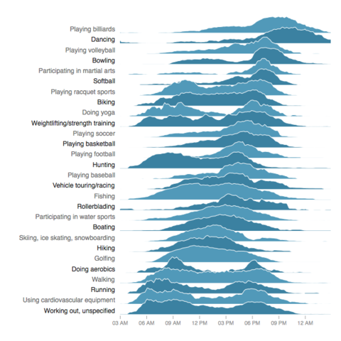
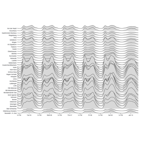
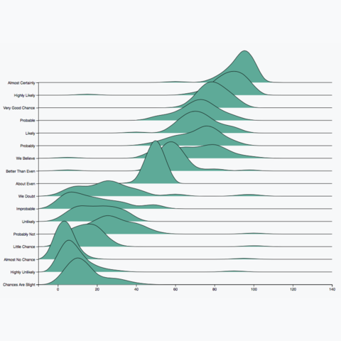
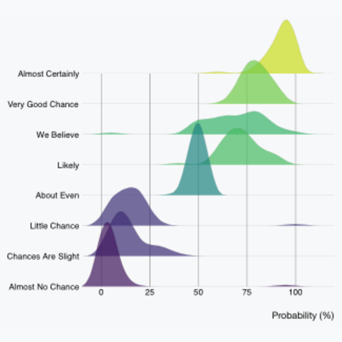
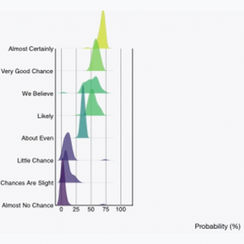
A selection of examples showing the application of the basic concept to real life dataset.

Related chart types


Violin
Density
Histogram
Boxplot
Ridgeline